 Cart
Cart|
Home > Learn XML > XML Tutorials > Building Dashboards with XSLT, SVG and HTML 5
Building Business Dashboards using XSLT, SVG, HTML 5(click images to see full size) Today’s economy has dramatically changed the way companies do business, having an online presence is no longer sufficient, and order management systems have to be real-time and accessible on a large variety of devices: desktops, laptops, tablets, mobile phones. Traditional software architecture involving thick clients could not keep up with the impressive pace of change. Large IT departments could not roll out clients fast enough for each combination of platforms and devices and keep up with social media integration. The industry had to adjust quickly to new trends and still deliver robust solutions, standard based, and accessible from anywhere, anytime. In this article, we will explore how to build a simple but modern dashboard for publishing sales results. We will combine proven standards, like XML and SVG (Scalable Vector Graphics) that are integral parts of any enterprise platform, with innovative new trends like HTML 5 mobile browser. Our goal is to present the sales data for a hypothetical company with offices across the US, in a manner that is easy to interpret and is accessible from desktop and mobile browser. Here is the feed with the sales numbers for the five regions, North East, North West, South East, South West and other territories, broken down by products. The data is provided to us as single XML document. 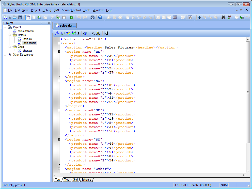
Here is the XML Schema that describes the format: 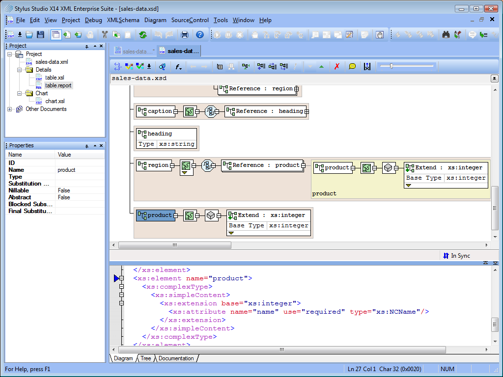
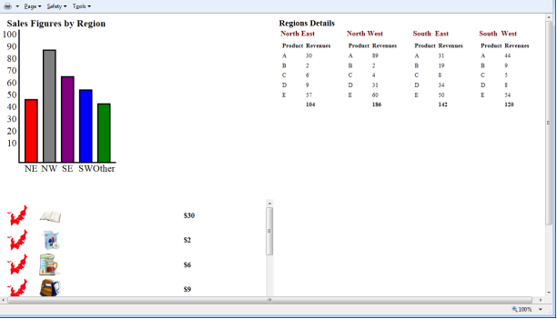
This is essentially what we need to build our dashboard; the design will be simple yet efficient. Our goal is to produce a chart to display the sales trend by region as well as a tabular representation to allow the drill down by products. In addition, we want a real-time feed that will show purchases as they happen. In order to have all information on the screen at the same time, we will assemble three quadrants in a single page. The scaffolding for our dashboard will be a HTML page made of three iframe components. Using HTML iframe allows us to break the design into separate pages; each iframe will point to a separate page. Here a simple diagram to outline the page layout: 
We can create the main HTML page easily using the Stylus Studio XML Editor. 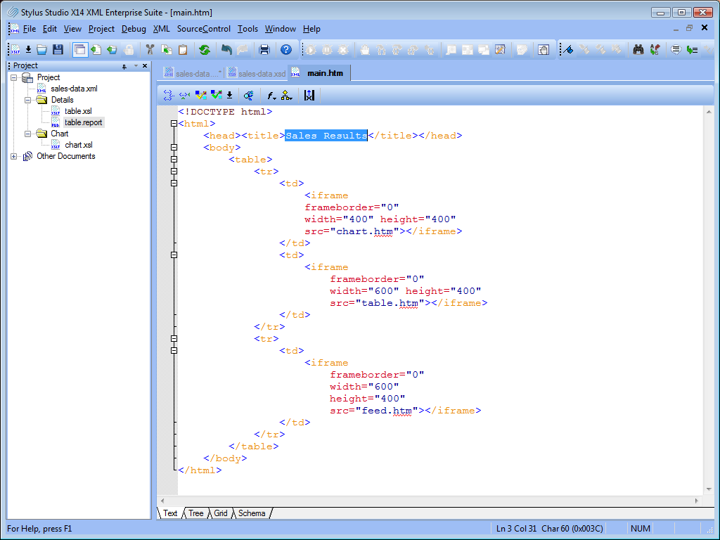
Now that we have the page skeleton, we can start building each quadrant. On the top left, we are going to place the chart. For generating the chart, we are going to design a simple XSLT transformation that takes the sales data and generates SVG. SVG (Scalable Vector Graphics) allows drawing high quality, two dimensional, resizable shapes using a powerful markup language. SVG has been around for years, but its success was limited because all major browsers required a third party plug-in in order for SVG to work, so many developers shied away from it. Why did we select it then? The success of HTML 5 forced all major browser vendors to implement the HTML 5 Canvas to unlock the power of the latest graphic cards to thousands of Java Script developers around the world. One of the side effects was that the Canvas specifications defined support for inline SVG as a requirement. All major browsers like Internet Explorer 9, Google Chrome, Apple Safari, Mozilla Firefox and Opera support HTML 5 and therefore SVG 1.1. The following screenshot shows an XSLT transformation that generates SVG; in the preview window you see the resulting chart. A for-each loop statement iterates on each region and calculates the revenues total to determine the rectangular height. 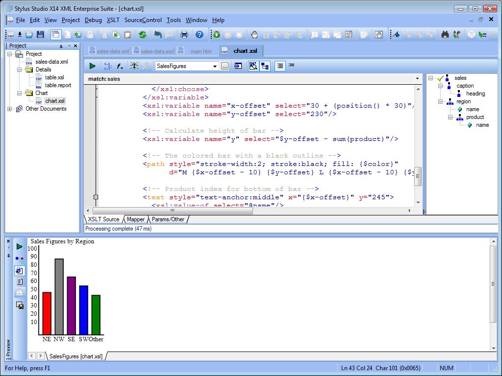
Now that the chart is ready, we can work on the drill down by products report. For the report, we are going to use Stylus Studio XML Publisher to generate a spreadsheet-like page. The main layout is a table where each column represents a region, under each region a sub table displays the revenues for each product, the last line in bold captures the total revenues for the region. Notice that the glyphs in yellow represent dynamic values that get calculated when the report runs. The result in the preview window will become the dashboard quadrant on the top right. 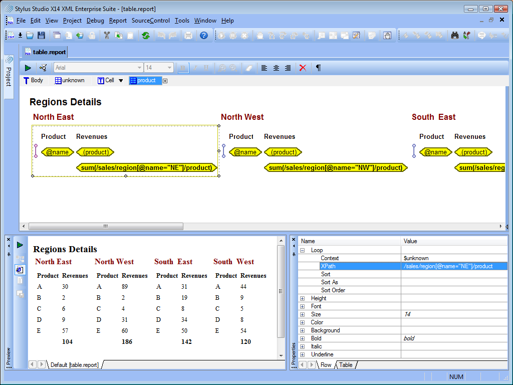
To complete our project we need to design the real-time transaction feed. For each transaction, the feed will display the image representing the region where it occurred, a product icon and the product price. We are going to build the feed using a simple XSLT transformation; the output will be like the Twitter stream. 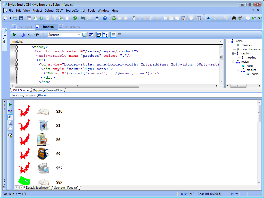
Our third quadrant is ready, now we can finally see the result assembled in a single page. Hope you enjoyed reading this article, if you have any questions do not hesitate to contact us. You can download the Project Zip file by clicking here. You can see the end result by clicking here. - Stylus Studio Team  Technical Support Technical Support Follow us on Twitter Follow us on Twitter Connect on Facebook Connect on Facebook
|
PURCHASE STYLUS STUDIO ONLINE TODAY!!Purchasing Stylus Studio from our online shop is Easy, Secure and Value Priced! 
Try Stylus Powerful XQuery IDEDownload a free trial of our award-winning IDE for XQuery today! What's New for Stylus Studio® X16?New XQuery & Web Services Tools, Support for MySQL, PostgreSQL, HL7 EDI, Microsoft .NET Code Generation and much more! Why Pay More for XML Tools?With Stylus Studio® X16 XML Enterprise Suite, you get the most comprehensive XML tool suite at one incredibly low price. Value: it's just one of many reasons why smart XML developers are choosing Stylus Studio! Top Ten XQuery TrendsRead about the top 10 XQuery Trends and how they will impact change the way enterprise software applications are built. |
XML PRODUCTIVITY THROUGH INNOVATION ™


